

The choice of artwork for Student Health Services’ (SHS) space has often befuddled me. I wish that it was more health and wellness-oriented. But what does that mean? I think of my own interpretation of health and my brain momentarily conjures images of dancing bodies. More often than not, health and wellness evoke in me auras and smells of apple greens, canary yellows, and papaya reds.
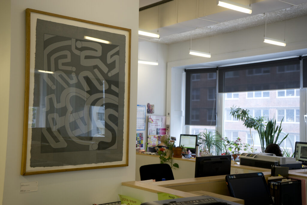
On an almost daily basis, I walk by and, at times, stand next to Chryssa’s Gates to Times Square #14. It is next to the photocopier/scanner/fax machine which records/scans our labor. It’s a piece with multiple shades of black and gray; it has none of the colors or shapes I associate with well-being and yet, trying to choose a piece for this reflection brought me to it. Why?
I re-visit the serigraph and slowly pull into me the ingredients of the piece that resonate. The choice of gray paper, the absence of white, partial labyrinths and sporadic circles. I like feeling lost, of picking a place in the paper and finding my way around. I am delighted by the sudden stops and U-turns. I like its size. I imagine what the piece would be if it was in other colors, and then go back to its current grayscale. It feels right as is, but is it right for this space?
What do health and well-being evoke in you? (Close your eyes, think the word.) What assumptions are typically made in choosing art for a health center?
What kind of power do you believe art can wield in spaces of vulnerability?
Is our relationship to the photocopier connected to our relationship to the art work next to it?
Tamara Oyola-Santiago
Staff, The New School